See where Bitcoin actually traded, not only when it traded.
A normal volume histogram groups volume by time. Volume Profile Visible Range, usually called VPVR, groups it by price. The longest horizontal bars reveal prices where the market spent volume reaching agreement; the thinnest areas reveal prices it moved through with less acceptance.
How to read the horizontal bars
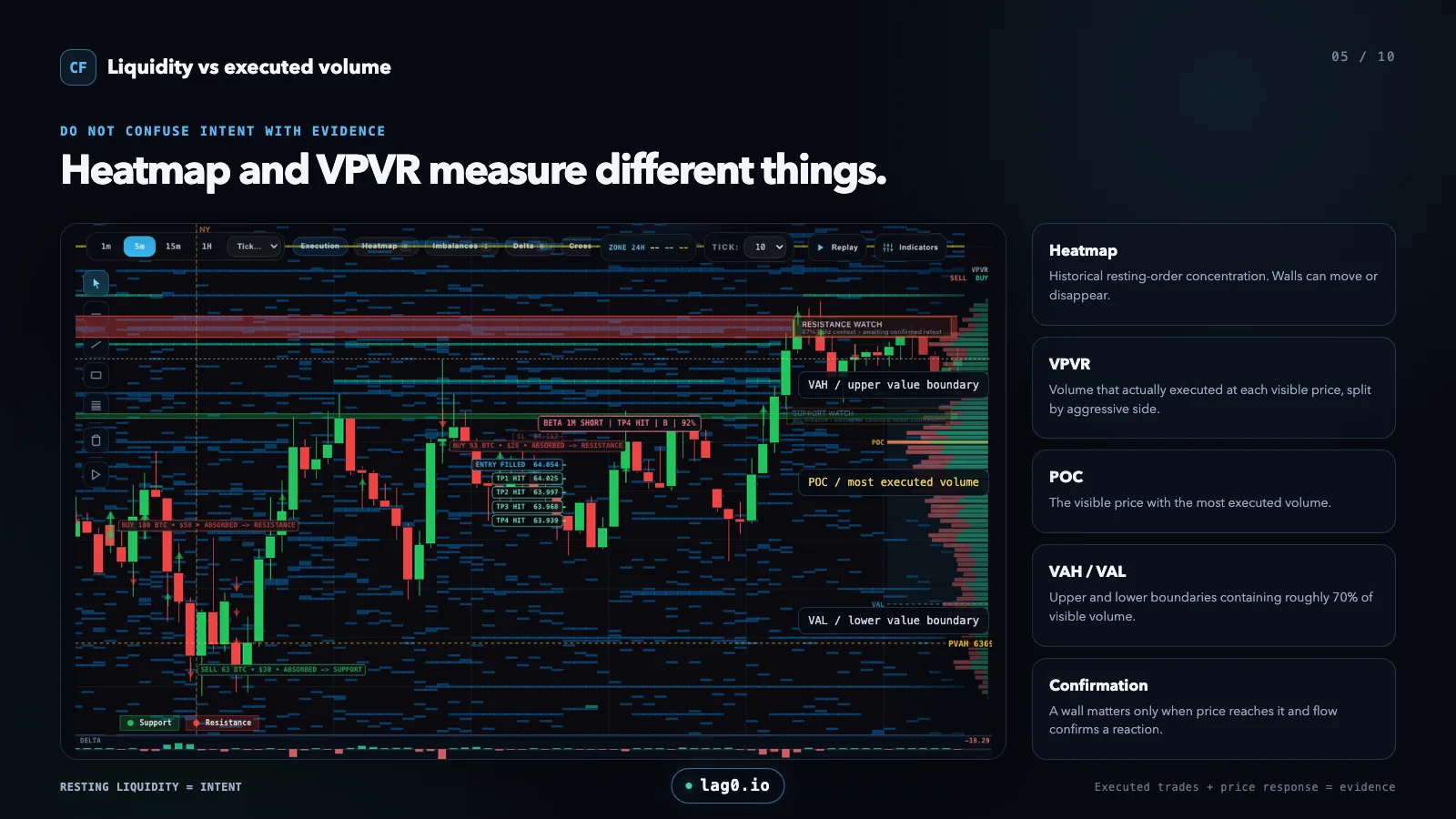
The profile is a map of historical acceptance. A long bar means more volume traded there; it does not tell you which direction price must move next.
Point of Control
The POC is the single price level with the highest traded volume inside the selected range. It often acts like a reference or magnet during balanced trade because it represents the strongest prior agreement. It is not automatically support or resistance.
High-volume nodes
HVNs are broader bulges in the profile. Price spent meaningful two-sided volume there, so future movement can slow, rotate or re-establish value around the same area. They describe acceptance rather than a precise entry line.
Low-volume nodes
LVNs are thin sections between accepted areas. Price previously crossed them with less business. A market can move quickly through an LVN, or reject it and return to the prior high-volume area.
VPVR versus heatmap liquidity
Confusing executed volume with displayed liquidity is one of the most common order-flow errors.
Volume Profile / VPVR
- Built from trades that already executed
- Grouped horizontally by price
- Shows historical acceptance and rejection structure
- Changes when the visible chart range changes
- Cannot be cancelled after the fact
Liquidity Heatmap
- Built from displayed resting limit orders
- Tracks where liquidity appeared over time
- Shows potential future friction, not completed volume
- Walls can move, refresh or disappear
- Needs execution and price response for confirmation
A repeatable workflow
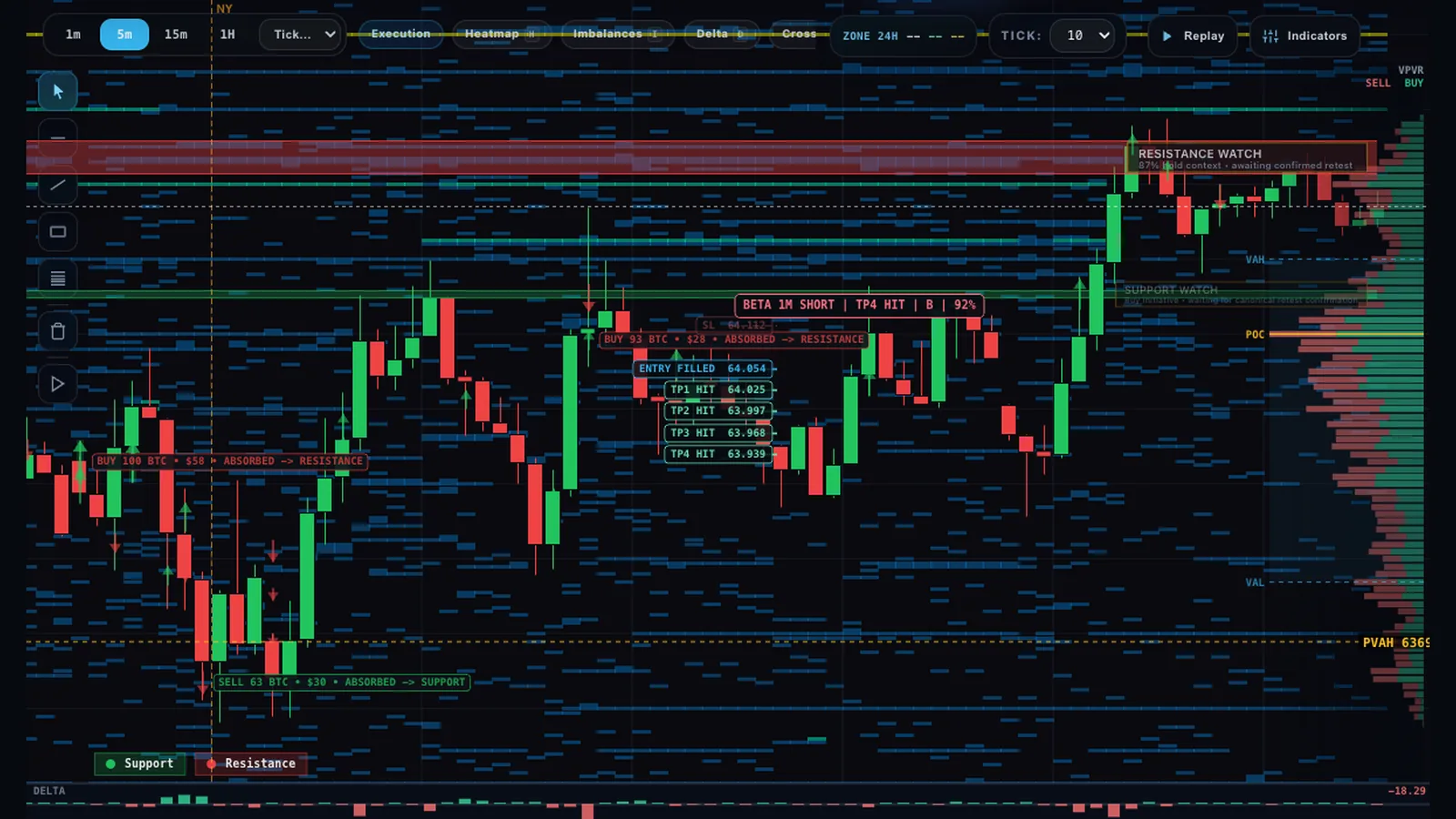
VPVR is most useful as a location tool. Footprint and reaction data then explain what is happening when price reaches that location.
1. Choose a meaningful visible range
Fit the chart around the session or swing you are actually analyzing. Because VPVR recalculates from visible data, random zoom changes can move the POC and alter the profile. Keep the range intentional.
2. Mark acceptance and transition
Identify the main HVNs, the POC and the LVNs that separate them. This gives you a map of likely rotation areas and thinner transition zones before the live test happens.
3. Observe the approach
A fast directional approach into an HVN is different from slow rotation already inside it. Use Delta and CVD to judge the pressure behind the move.
4. Confirm the reaction
At the level, look for continuation, absorption or failed acceptance with the footprint. A profile level alone is context, not a signal.
FAQ
What does VPVR show?
It shows how much volume traded at each price inside the visible chart range. The horizontal bars describe historical participation and acceptance.
What are POC, HVN and LVN?
POC is the highest-volume price. HVNs are broader accepted areas, while LVNs are thinner transition areas with comparatively less executed volume.
Is volume profile the same as a heatmap?
No. VPVR contains completed trades. A heatmap contains displayed resting liquidity, which may change or disappear before any trade occurs.
Map acceptance before reading the live reaction.
Enable VPVR in CryptoFlow, frame a deliberate visible range, then compare each profile level with footprint and liquidity.